
DOLLAR GENERAL
Creative Strategist / Art Director
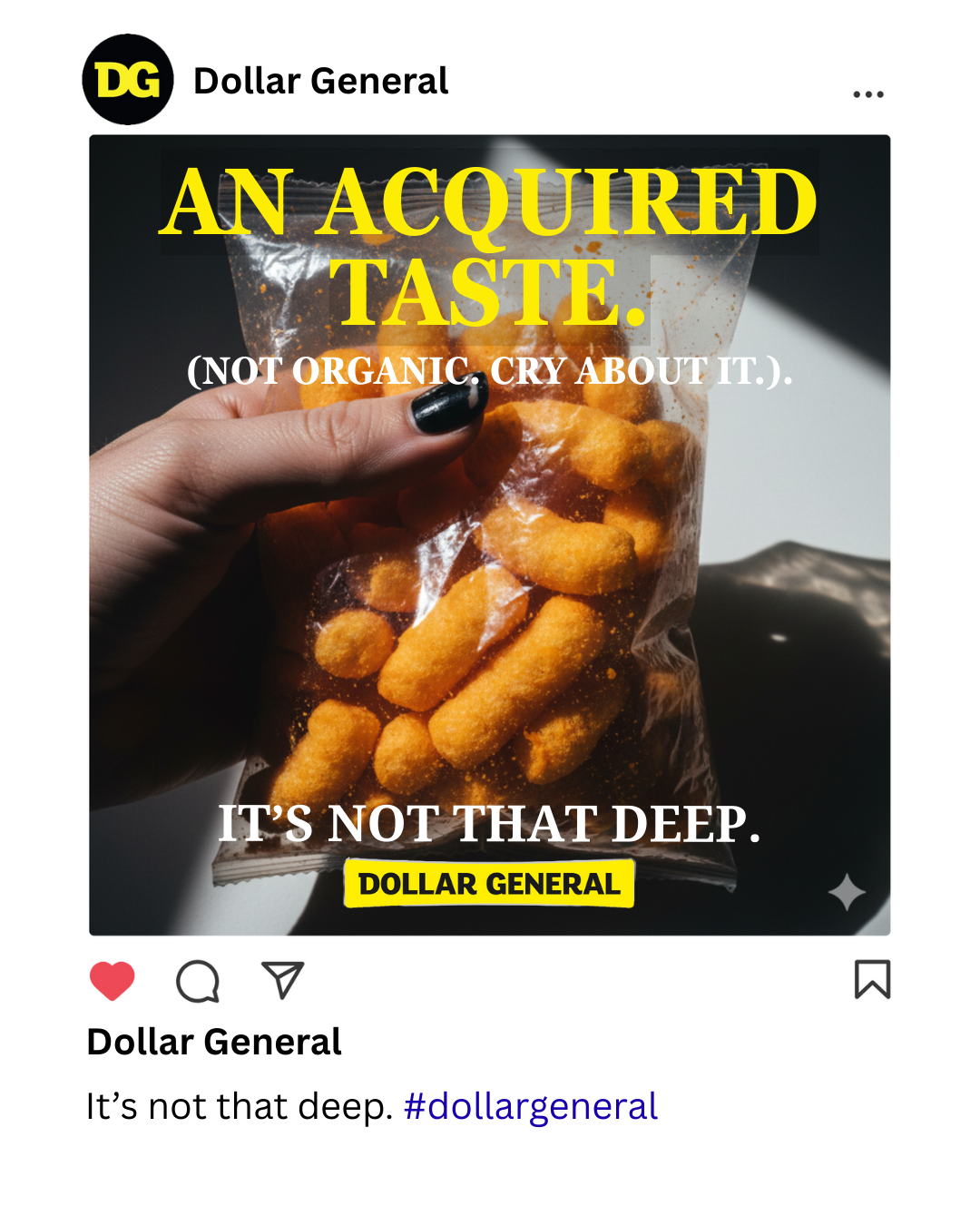
THE SITUATION: How do you turn social shame into a social flex? Dollar General suffers from a perception problem: Gen Z avoids the store not because of the products, but because of the "ick"—the fear of looking broke or low-effort. The business goal was to drive Trial among "Burned-Out Performers" (22-25 year olds) who are exhausted by the pressure to curate a luxury aesthetic on an entry-level budget. We needed to prove that Dollar General isn't a compromise; it’s the smart way to opt out of the rat race.
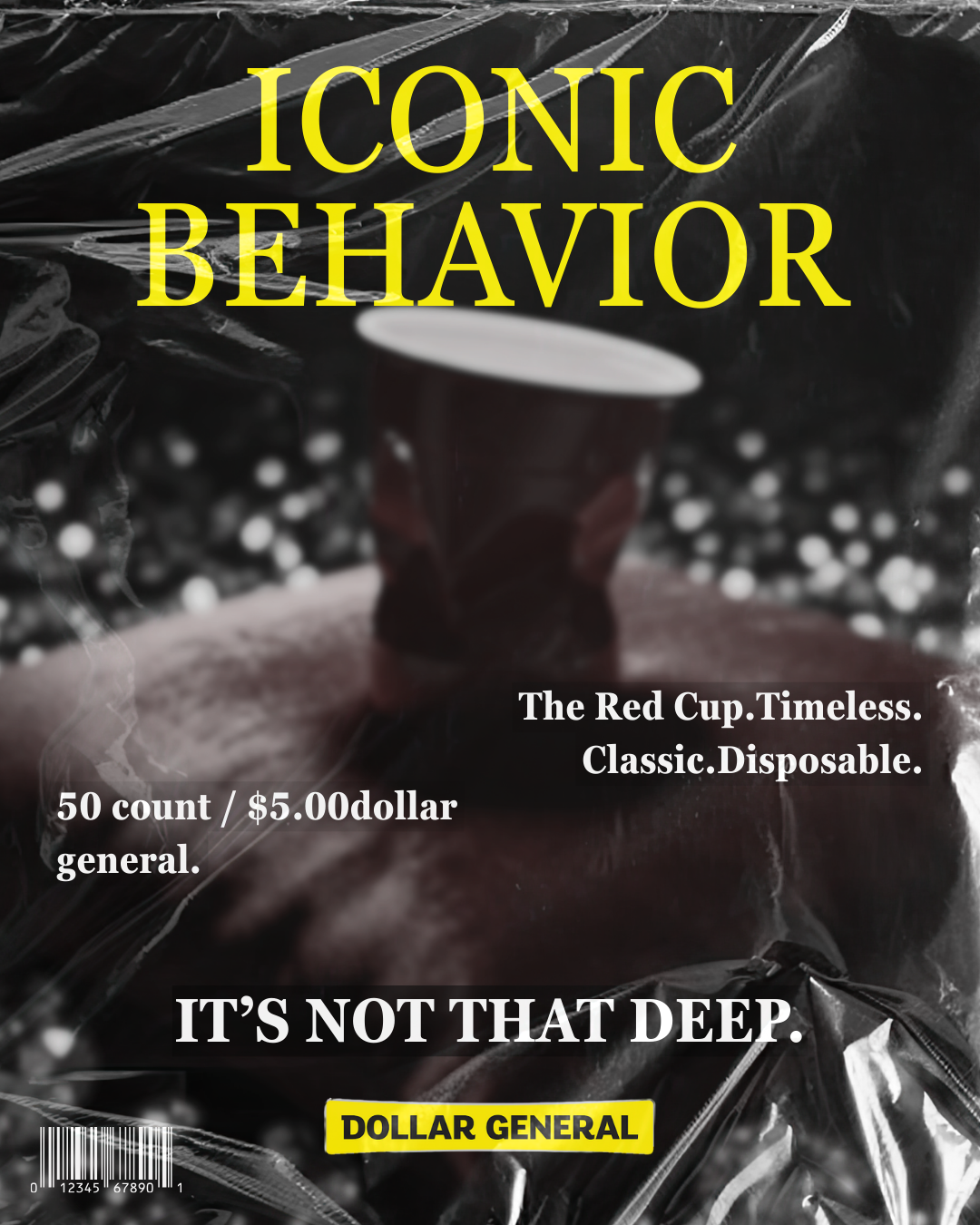
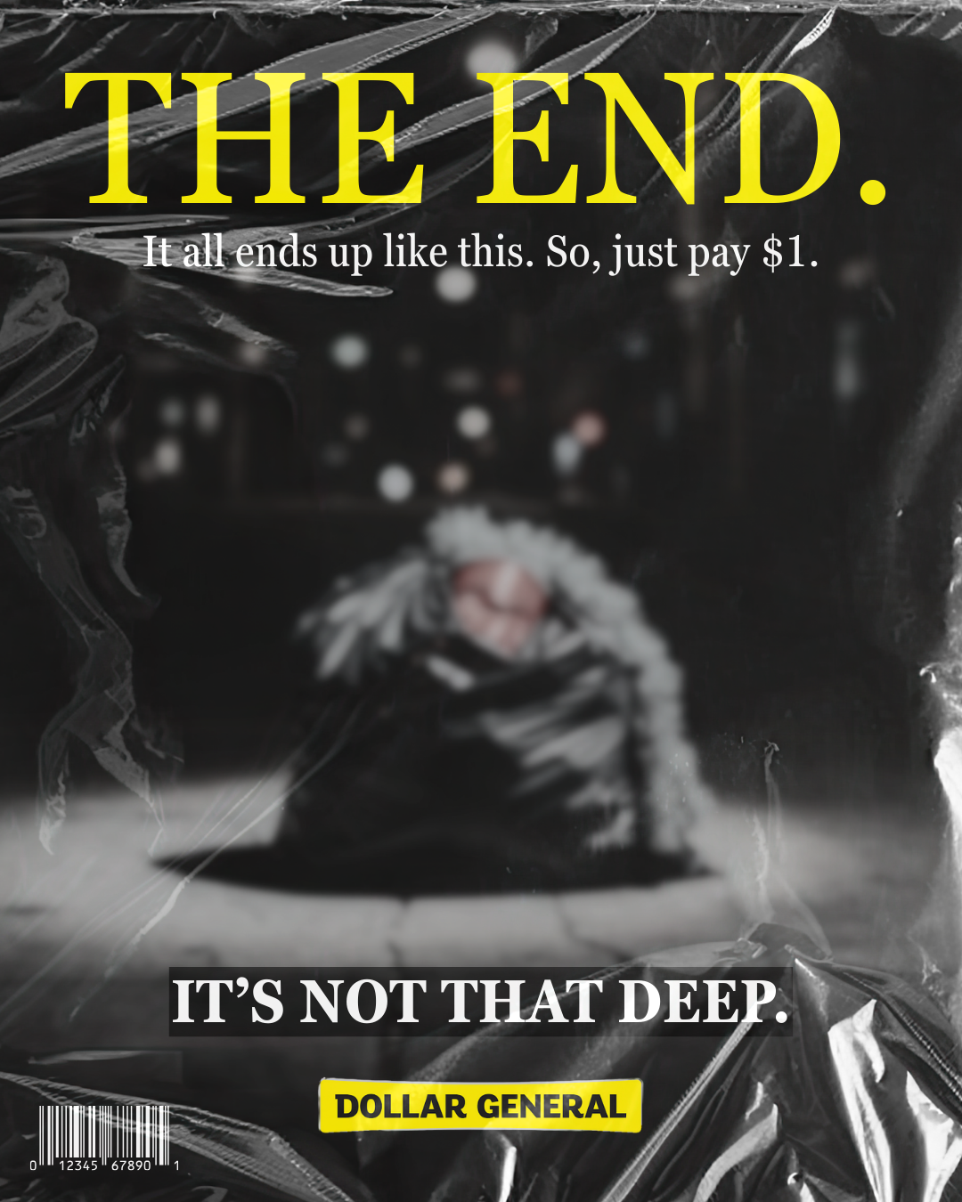
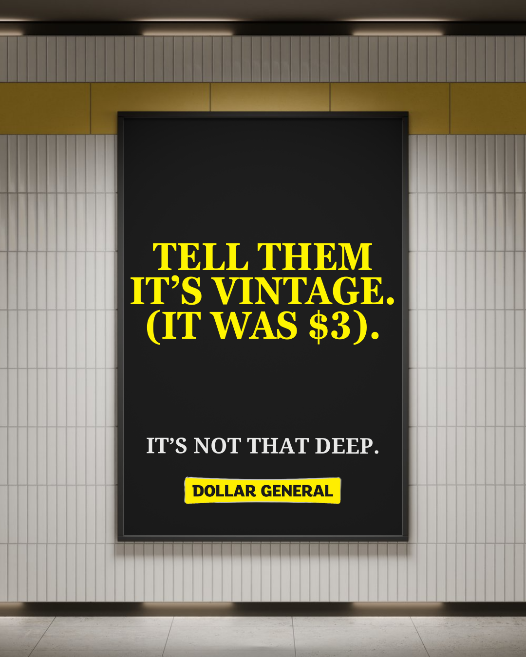
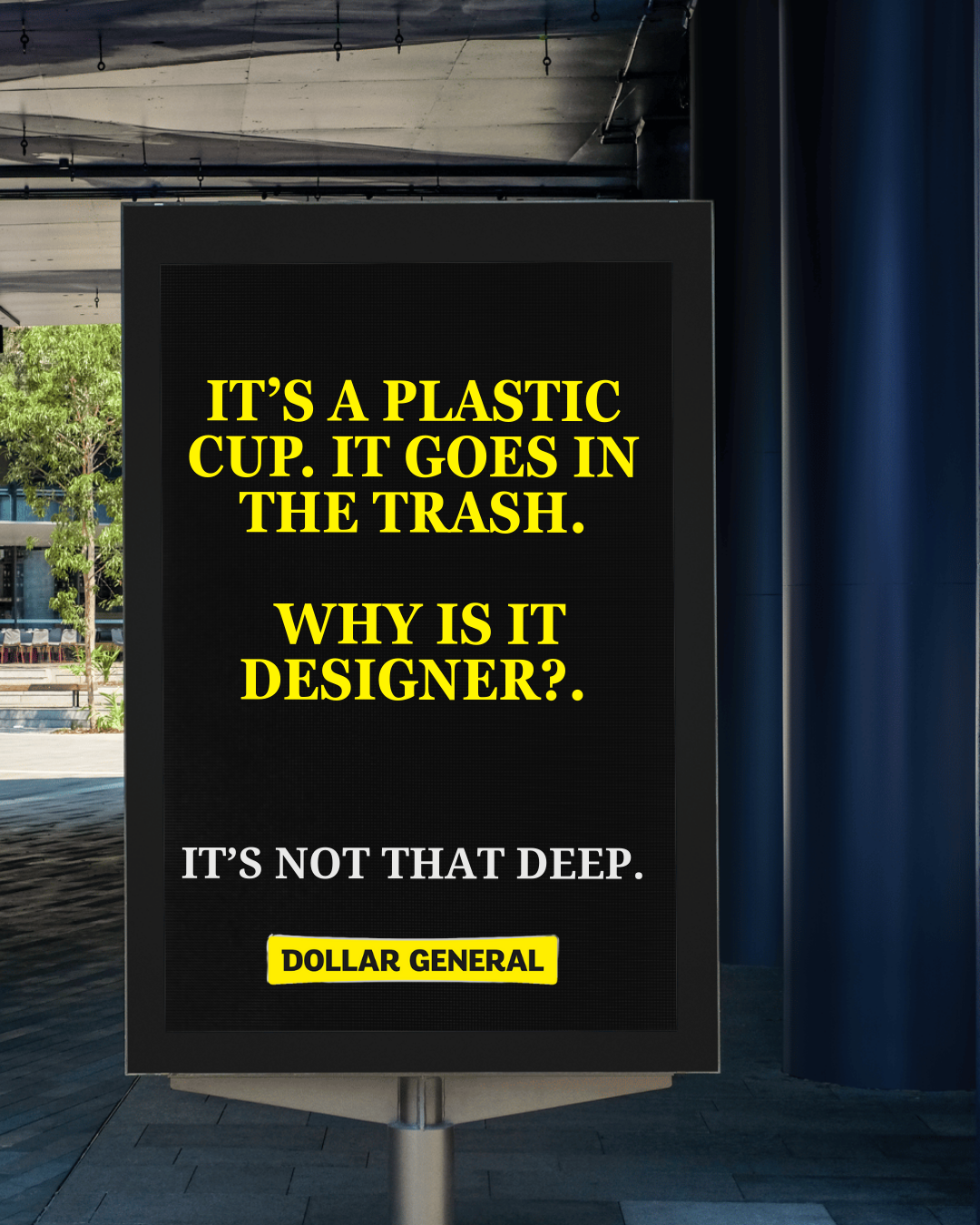
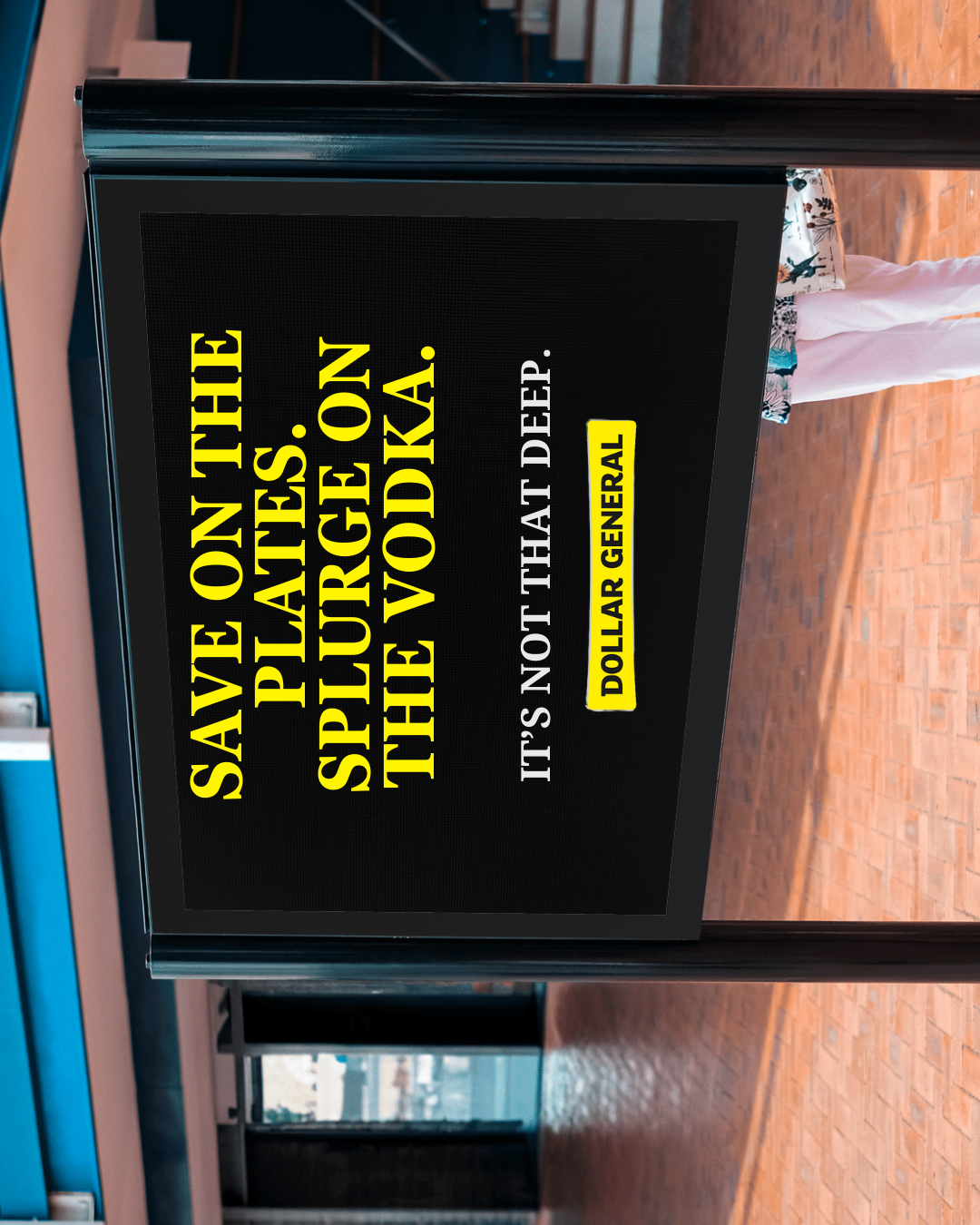
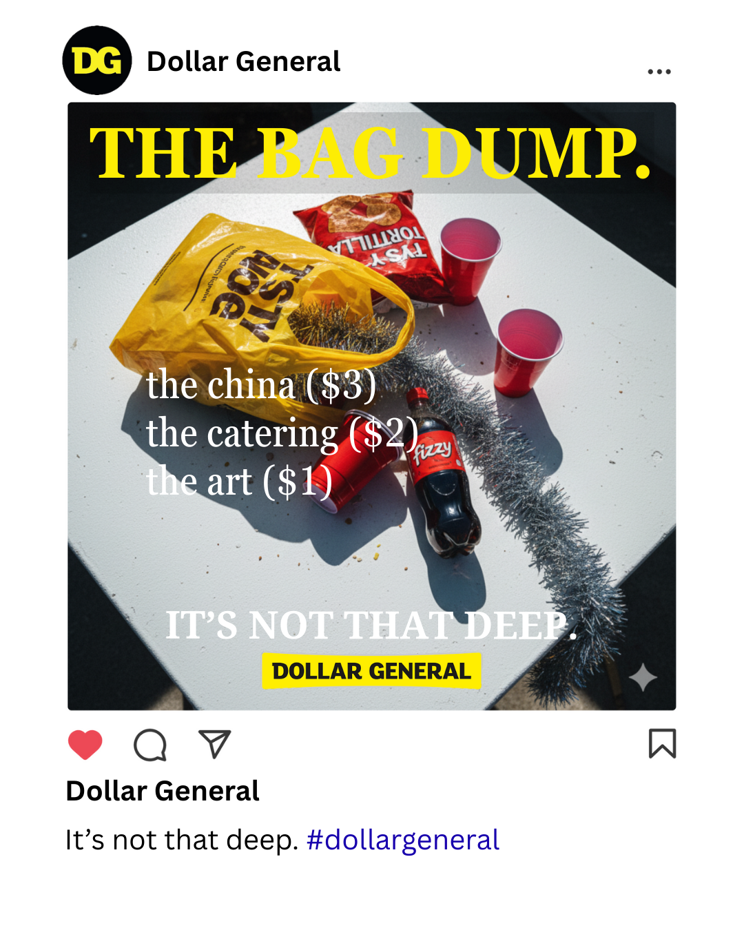
THE APPROACH: De-Influence the Holidays. While competitors were selling "Perfect Family Magic," we pivoted to Radical Honesty. We identified a cultural tension: Gen Z is rebelling against performative overconsumption. Our strategy was to position Dollar General as the "Anti-Aesthetic" brand. Through a "Lo-Fi Luxury" visual identity (high-flash photography, blunt copy, and satirical fashion magazine layouts), we stripped away the marketing fluff to show the raw truth: A paper plate is just a paper plate. The campaign tagline,
"IT’S NOT THAT DEEP," acted as a permission slip for consumers to save money without the guilt.
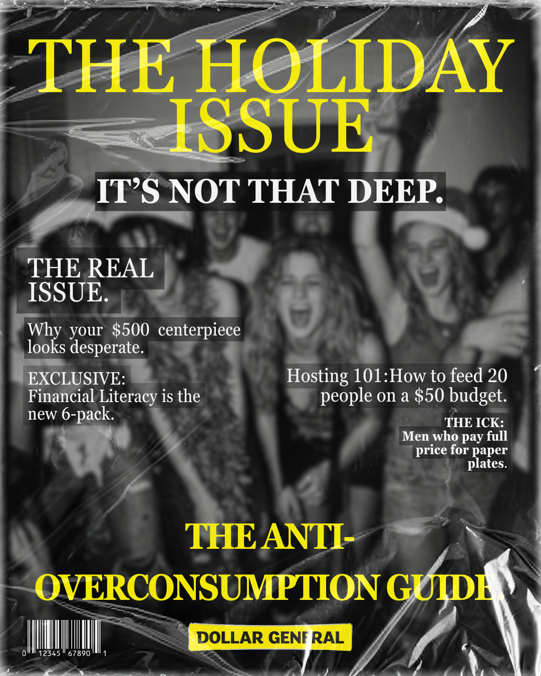
Creative Concept 1
Creative Concept 1
Creative Concept 1
Creative Concept 2
Creative Concept 2
Creative Concept 2
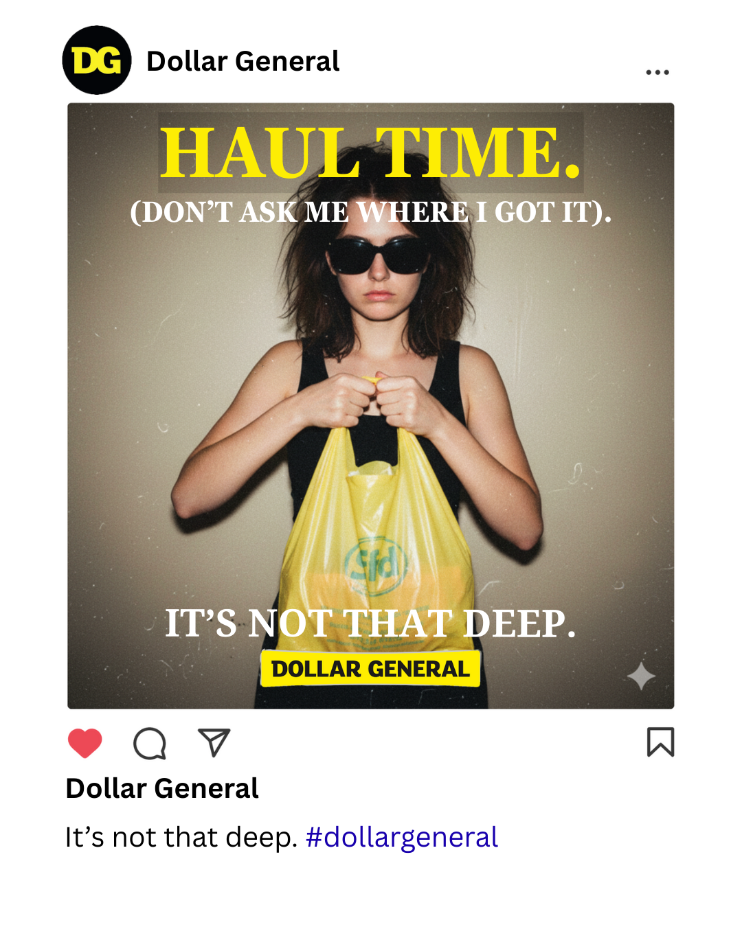
Creative Concept 3
Creative Concept 3
Creative Concept 3